
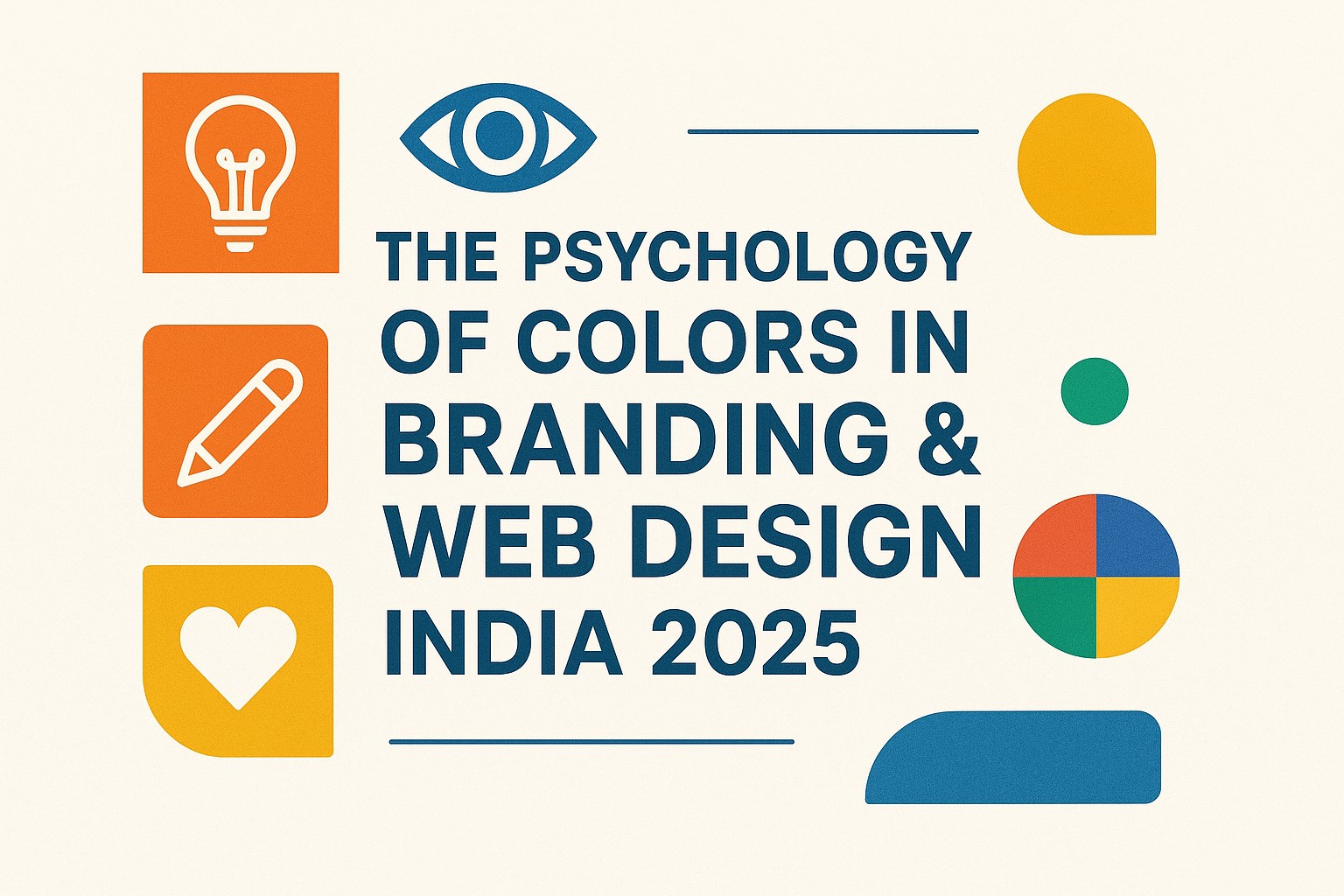
The Psychology of Colors in Branding & Web Design
When it comes to branding and web design, colors are not just decorative elements—they shape emotions, decisions, and brand perception. In India’s competitive digital market of 2025, businesses are realizing that choosing the right color palette can be the difference between building trust or losing potential customers. From startups in Gurgaon to e-commerce stores across Mumbai, color psychology in branding and web design has become a key factor in digital marketing strategies. The colors you select can influence how Indian consumers perceive your brand, interact with your website, and ultimately, whether they choose to buy from you. This blog will dive deep into the psychology of colors, their impact on branding, and how Indian businesses can use them to design more impactful websites that attract and convert.
Why Color Psychology Matters in Branding
In today’s competitive Indian market, customers are bombarded with countless brands every single day. What makes one brand stand out from another often comes down to the visual identity—and at the heart of this identity lies color psychology. Colors influence emotions, perceptions, and even buying decisions, making them a powerful tool for brand growth in 2025.
1. First Impressions Count
Studies show that people form a subconscious impression of a brand within seconds, and up to 90% of that judgment is based on colors. For Indian businesses, whether it’s a logo, website, or product packaging, the right color can instantly communicate trust, luxury, excitement, or eco-friendliness.
2. Building Brand Recognition
Colors create consistency and memorability. Think about Zomato’s bold red, Jio’s blue, or Ola’s black and yellow—these shades are now synonymous with their brands. When used strategically, colors strengthen recall and make your business instantly recognizable in a crowded market.
3. Emotional Connection with Consumers
Each color triggers specific emotions. For example:
-
Red – urgency, passion, appetite (used by food delivery apps).
-
Blue – trust, professionalism (popular in fintech and IT).
-
Green – health, nature, eco-consciousness (common in organic brands).
-
Orange & Saffron – energy, tradition, creativity (resonates deeply with Indian culture).
By choosing the right colors, businesses can connect with customers’ cultural values and emotions.
4. Guiding Consumer Behavior
Colors also influence decision-making. On websites, contrasting call-to-action (CTA) buttons like “Buy Now” in orange or “Sign Up” in green encourage clicks. For Indian e-commerce brands, optimizing web design with color psychology can directly impact sales and conversions.
5. Standing Out in a Competitive Market
In crowded industries like food delivery, edtech, or fashion, color choices differentiate your brand from competitors. A unique color palette helps position your brand with a distinct identity and message.
In short, color psychology is not just about aesthetics—it’s about strategy. For Indian businesses, using the right colors in branding can build trust, boost recognition, and drive customer action, making it an essential part of digital marketing success in 2025.
Popular Colors & Their Meanings in Branding
Colors are more than just visual elements—they are powerful psychological triggers that shape how consumers perceive and interact with brands. In India, where culture, tradition, and symbolism play a huge role in consumer behavior, choosing the right color palette for branding can make or break your business identity. Let’s look at the most popular colors and their meanings in Indian branding.
1. Red – Passion, Energy & Urgency
-
Red is one of the most powerful colors in Indian branding. It symbolizes energy, excitement, and even good fortune in Indian culture.
-
Brands like Zomato and Airtel use red to create a sense of urgency and strong brand recall.
-
In digital marketing, red often encourages fast decision-making and is commonly used in food, retail, and entertainment industries.
2. Blue – Trust, Reliability & Professionalism
-
Blue is associated with trust, peace, and professionalism. It’s widely used by Indian fintech, banking, and IT companies.
-
Brands like HDFC Bank, Jio, and Infosys leverage blue to establish credibility and reliability.
-
For web design, blue is perfect for call-to-action buttons and customer service pages because it promotes a sense of security.
3. Green – Growth, Nature & Sustainability
-
Green is strongly linked with health, eco-friendliness, and prosperity in India.
-
Organic brands, Ayurveda startups, and environment-conscious businesses use green to connect with consumers who value sustainability.
-
For example, Patanjali and other wellness brands use green to highlight natural and holistic lifestyles.
4. Yellow & Saffron – Optimism, Tradition & Spirituality
-
Yellow and saffron hold deep cultural significance in India. They represent positivity, enlightenment, and spiritual energy.
-
Many educational institutes, food brands, and cultural startups incorporate yellow to appear warm and approachable.
-
Saffron, often tied to Indian tradition, is used by brands that want to emphasize heritage and authenticity.
5. Black – Power, Luxury & Modernity
-
Black signifies sophistication, authority, and exclusivity.
-
In India, luxury fashion, premium tech, and automobile brands use black to build an elite appeal.
-
Ola’s black-and-yellow theme also cleverly connects with urban commuting while maintaining brand distinction.
6. Orange – Energy, Creativity & Innovation
-
Orange is dynamic, youthful, and vibrant. It appeals to India’s young demographic and startups.
-
Myntra and Swiggy use orange to signal energy and creativity, making their branding more fun and engaging.
7. White – Simplicity, Peace & Minimalism
-
White symbolizes simplicity, purity, and peace in Indian culture.
-
It is often paired with bold colors for balance in branding. Many tech startups use white-dominant websites for a clean and modern look.
8. Purple – Luxury & Uniqueness
-
Purple is less common in Indian branding but is increasingly used by brands that want to stand out.
-
It conveys luxury, creativity, and uniqueness, making it suitable for cosmetics, lifestyle, and premium services.
👉 In India’s culturally diverse market, color psychology in branding isn’t one-size-fits-all. Brands must carefully select shades that not only represent their identity but also resonate with Indian consumers’ cultural and emotional values.
Using Colors in Web Design for Better Conversions
In today’s digital-first world, web design plays a huge role in shaping user experience (UX) and directly impacts how visitors interact with your brand online. One of the most overlooked yet powerful elements of web design is color psychology. The right color palette doesn’t just make your website visually attractive—it can significantly improve engagement, trust, and conversions.
Here’s how using colors in web design can boost your conversions:
1. Call-to-Action (CTA) Buttons
-
Bright, contrasting colors for CTAs (like red, orange, or green) make them stand out and encourage clicks.
-
Example: E-commerce brands in India often use green “Buy Now” buttons because green is linked with positivity and action.
2. Navigation & Readability
-
A well-balanced color scheme improves website readability and navigation.
-
Dark text on light backgrounds (often white or pastel shades) makes content easier to scan, especially on mobile devices.
-
Brands that use minimalist web design with white space often see lower bounce rates.
3. Building Trust with Colors
-
Using shades of blue, white, and grey in your website layout helps build trust and credibility.
-
This is why most Indian fintech and IT companies prefer blue-based designs for their websites.
4. Highlighting Key Information
-
Colors can guide users’ eyes toward specific content, offers, or deals.
-
For instance, yellow or saffron highlights are effective in drawing attention to limited-time promotions, especially for Indian users who associate saffron with tradition and positivity.
5. Emotional Triggers in E-Commerce
-
Red and orange create urgency, making them perfect for flash sale banners.
-
Green and earthy tones are ideal for organic, Ayurvedic, or eco-friendly product websites, building an instant connection with health-conscious audiences.
6. Consistency Across Branding & Web Design
-
Your web design colors should match your brand’s overall identity. For example, if your logo uses blue and orange, your website should reflect those colors to maintain brand consistency.
-
This strengthens recall and creates a seamless customer experience across platforms.
👉 In short, colors in web design are more than aesthetics—they’re a conversion strategy. Whether it’s improving user trust, increasing click-through rates, or guiding visitors toward purchases, the right use of colors can transform a good website into a high-performing one.
Real-Life Indian Brand Examples
The best way to understand the power of color psychology in branding and web design is to look at how successful Indian brands use it strategically. Each brand carefully selects its color palette to communicate values, build trust, and connect with its audience emotionally.
Here are some real-life Indian brand examples that prove how impactful the psychology of colors can be:
1. Airtel – Red for Energy & Passion
-
Airtel’s branding is dominated by a vibrant shade of red.
-
Red reflects energy, passion, and excitement, aligning perfectly with the fast-paced world of telecom and connectivity.
-
Its website and app also use red for key highlights, creating urgency and encouraging quick action.
2. HDFC Bank – Blue for Trust & Security
-
HDFC Bank uses a bold blue in its branding and website.
-
Blue is globally associated with trust, reliability, and professionalism, which is vital for financial services.
-
Their website design maintains a consistent blue palette, giving customers a sense of safety while managing finances online.
3. Zomato – Red for Appetite & Urgency
-
Zomato’s strong red branding isn’t just eye-catching—it stimulates appetite and creates urgency in decision-making.
-
Whether it’s their app or website, red buttons and banners make users feel hungry and take quick actions like “Order Now.”
-
This is a prime example of color psychology in Indian e-commerce and food delivery apps.
4. Tanishq – Gold for Luxury & Tradition
-
Tanishq’s branding often features shades of gold, cream, and deep maroon, colors that symbolize luxury, wealth, and tradition in India.
-
Their web design mirrors this palette, giving customers a premium, regal shopping experience aligned with the jewelry market.
5. Ola – Yellow & Black for Visibility
-
Ola’s use of yellow and black is no accident.
-
Yellow signifies energy, friendliness, and movement, while black adds professionalism and boldness.
-
The colors also provide strong visibility, making the app easy to recognize instantly on mobile screens.
👉 These Indian brand examples show that color psychology isn’t just theory—it’s a powerful branding and web design strategy. Whether you’re building trust like HDFC, sparking appetite like Zomato, or symbolizing luxury like Tanishq, the right colors can define how your audience perceives and engages with your brand.
Tips for Choosing the Right Color Palette for Your Brand
Choosing the right color palette for your brand is one of the most critical steps in shaping your identity and building trust with your audience. The right colors don’t just make your brand look attractive—they influence how customers perceive your values, connect emotionally, and even decide whether or not to engage with you. For Indian businesses in 2025, selecting the right color scheme can give a major competitive advantage in branding and web design.
Here are some practical tips to help you make the right choice:
1. Understand Your Target Audience
-
Colors trigger emotions differently across demographics.
-
For example, younger Indian audiences may resonate with bold and vibrant shades, while older customers may prefer subtle and traditional palettes.
-
Conduct surveys or A/B testing to see which colors connect best with your audience.
2. Align with Brand Personality
-
Define your brand’s tone: Is it playful, professional, luxurious, or eco-friendly?
-
A playful startup in Gurgaon may benefit from vibrant tones like orange or yellow, while a law firm in Delhi would project authority with blues and greys.
3. Consider Cultural Significance in India
-
In India, colors carry strong cultural meanings.
-
Red is linked with celebration and energy, green with growth and prosperity, and saffron with tradition and spirituality.
-
Use these insights to build a palette that resonates locally.
4. Limit Your Palette for Consistency
-
Stick to 2–3 primary colors and 1–2 secondary shades.
-
Overloading your branding with too many colors creates confusion and weakens recognition.
-
Consistency across your logo, website, and social media improves recall.
5. Focus on Digital Usability
-
Colors should look good on both print and screens.
-
Choose web-safe colors and ensure text has high contrast for readability.
-
For example, bright colors work well for call-to-action buttons, but background colors should remain neutral.
👉 By carefully selecting a color palette aligned with your audience, culture, and brand values, you can build stronger recognition and trust. Remember, the best Indian brands—like Airtel, HDFC, and Zomato—succeed not just because of their services, but because their colors tell a story that customers instantly connect with.
Conclusion
The psychology of colors in branding and web design is more than just an aesthetic choice—it is a powerful tool that shapes customer perception, builds emotional connections, and drives business growth. For Indian businesses in 2025, where competition is rapidly increasing across digital platforms, choosing the right color palette can be the difference between being noticed or being ignored.
From understanding cultural significance—like red symbolizing energy and celebration, or green representing prosperity—to creating web-friendly designs that improve conversions, colors influence how audiences interact with a brand. Whether you’re a startup in Gurgaon, a local retailer in Delhi, or an e-commerce brand targeting pan-India customers, your brand colors must reflect your identity, values, and customer expectations.
A well-thought-out color strategy can enhance recall, boost trust, and ultimately drive sales. When integrated smartly into logos, websites, and marketing campaigns, colors turn into a silent storyteller that communicates your brand personality without words.
👉 In short, color psychology isn’t just about design—it’s about creating a lasting brand impression. If you want your business to stand out in India’s competitive digital space, start by choosing colors that not only look good but also connect deeply with your audience.
❓ FAQs
Q1. Why is color psychology important in branding?
Color psychology is important in branding because it influences customer emotions, buying decisions, and brand perception. The right colors help businesses create trust, improve recall, and stand out in a competitive Indian market.
Q2. Which colors are most effective for Indian brands?
In India, red is linked with energy and festivals, yellow with positivity and spirituality, green with growth, and blue with trust and professionalism. Choosing the right color depends on the brand’s message and target audience.
Q3. How do colors affect website conversions?
Colors guide user behavior on websites by improving readability, highlighting CTAs (Call-to-Actions), and creating emotional connections. For example, bright colors like orange or green often improve click-through rates.
Q4. Can small businesses in India use color psychology effectively?
Yes, even small businesses can benefit from color psychology. By selecting colors that align with their brand story and audience preferences, they can build stronger brand recognition and increase customer loyalty.
Q5. What tools can help in choosing brand colors?
Tools like Canva, Coolors, and Adobe Color help businesses create harmonious palettes. Many Indian web designers also use AI-powered design tools to test color combinations for branding and web design.